

Founder of PoquitoTalk
When you spend weeks engineering a mobile app—fine-tuning localized speech models, integrating walkie-talkie audio protocols, and polishing UI animations—the paywall is usually the last thing you build before shipping.
Like most solo founders, I treated monetization as an afterthought. I whipped up a single generic modal in React Native, stuffed all our subscription tiers into it, slapped our primary brand color onto the purchase button, and told myself: "If users love the product, they’ll pay."
They didn't. Or rather, they hesitated.
Conversion stalled, bounce rates on the pricing screen were painful, and I fell into the classic developer ego trap: assuming my users simply "didn't get" the value.
Instead of brooding in isolation, I took a deep breath, grabbed screenshots of my raw, unvarnished paywall designs, and posted them publicly on X and indie founder forums, asking for brutal feedback.
The teardowns were ruthless. Experienced monetization pros, mobile UX designers, and fellow indie hackers pointed out glaring psychological traps, cognitive friction points, and visual blunders I was completely blind to.
Here are the 5 counter-intuitive paywall lessons that transformed our monetization architecture in PoquitoTalk from a leaky bucket into a high-converting, friction-free engine.
The Baseline Flaws: What V1 Got Wrong
To understand how far we came, look at our initial mental model versus reality:
[The Developer Illusion] ────────► Single paywall modal shown everywhere.
                                  Brand colors used for buttons.
                                  Vague credit terms.
                                  Two dismiss buttons on screen.

[The Community Teardown] ───────► Onboarding context is 100% different from in-app intent.
                                  The CTA button blended into the screen.
                                  Users suffered severe loss aversion on credits.
                                  Multiple escape hatches leaked conversions.
Let’s break down the five pivotal changes that rewrote our conversion rates.
Lesson 1: The Context Dichotomy (Onboarding Paywall ≠ In-App Paywall)
The Mistake
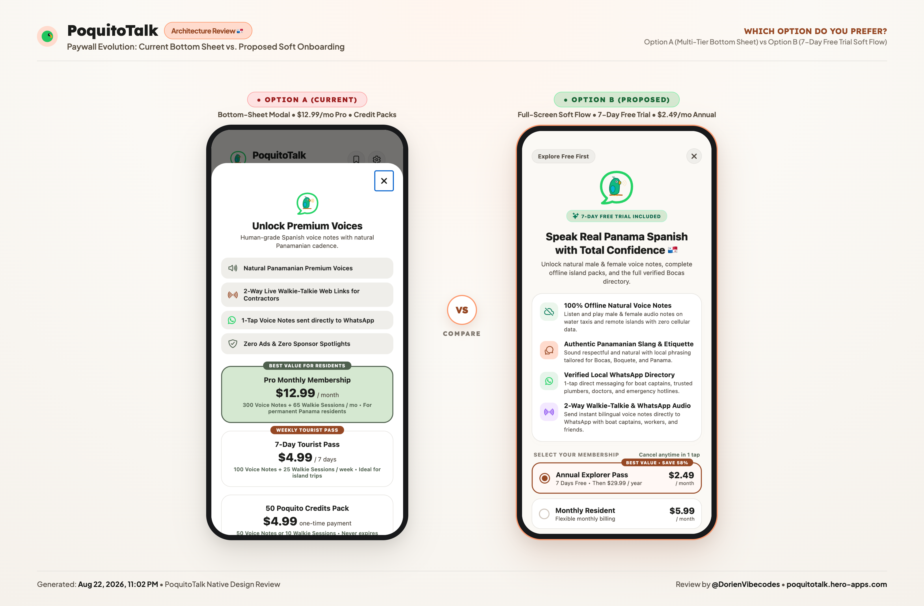
In our first build, we used a single component—a standard pop-up modal—for every monetization trigger in the entire app. Whether a user had just finished our 3-step onboarding walkthrough or had just hit their daily limit while trying to dispatch an urgent WhatsApp audio note to an island boat captain, they saw the exact same screen.
The Community Insight
A user finishing onboarding has an entirely different mindset than a user caught in a live in-app workflow:
- The Onboarding User is Exploring Value: They haven't used the core feature yet. They are hesitant, skeptical, and need reassurance. They need a 4-point benefit grid, trust reassurance, soft trial framing, and an airy, welcoming atmosphere.
- The In-App User is High-Intent & In a Hurry: They just tried to send an 11th voice note or start a 2-way live audio room. They already know the product works. Shoving a full-screen onboarding narrative in front of them is annoying and introduces friction when they just want to complete their task.
The Architectural Solution
We completely decoupled our monetization layer into two distinct React Native components:
SoftOnboardingPaywall.tsx: A full-screen, warm canvas (#FAF8F5) that displays our animated parrot mascot, a 4-card value grid (Voice on WhatsApp, Fast Island Repairs, Real Island Spanish, 2-Way Live Audio), and clear 7-day trial framing.PaywallModal.tsx: A compact, laser-focused bottom-sheet drawer that slides up smoothly over their active workspace, preserving screen context and offering a fast 1-tap checkout.
// Decoupled architecture in App.tsx / Screen handlers:
// 1. Soft Fullscreen Paywall for post-onboarding discovery
<SoftOnboardingPaywall
  visible={showOnboardingPaywall}
  onClose={() => setShowOnboardingPaywall(false)}
  onSuccess={handleSubscriptionSuccess}
/>

// 2. Compact Bottom Sheet for in-app trigger limits
<PaywallModal
  visible={showInAppPaywall}
  onClose={() => setShowInAppPaywall(false)}
  onSuccess={handleSubscriptionSuccess}
/>
Treating onboarding discovery and in-app gate limits as two distinct user states immediately reduced onboarding bounce rates and sped up in-app checkouts.
Lesson 2: The "Unique CTA Color" Rule (Eliminating Visual Noise)
The Mistake
PoquitoTalk's brand palette is rooted in warm Caribbean terracotta (#964824), palm sage green (#059669), and warm linen (#FAF8F5). Naturally, when designing the primary "Start 7-Day Free Trial" button, I styled it in our primary terracotta brand color.
The Community Insight
When your Call-To-Action button shares a color with your navigation icons, category badges, chip filters, and header tags, it competes with the rest of your app for visual dominance.
A user's eye scans a screen in milliseconds. If the button looks like just another decorative container or category pill, cognitive friction spikes. At the moment of conversion, there should be zero doubt about what the primary action is.
The Rule: The primary CTA button on your paywall must use a color that appears nowhere else in the entire application.
The Solution
We audited every hex code in our theme directory and introduced a brand-new, isolated accent: Bright Royal Indigo (#4F46E5).
// src/components/SoftOnboardingPaywall.tsx
const styles = StyleSheet.create({
  mainCtaButton: {
    width: '100%',
    backgroundColor: '#4F46E5', // Unique across the entire app
    paddingVertical: 15,
    borderRadius: 22,
    alignItems: 'center',
    justifyContent: 'center',
    shadowColor: '#4F46E5',
    shadowOffset: { width: 0, height: 4 },
    shadowOpacity: 0.35,
    shadowRadius: 10,
    elevation: 4,
  },
  ctaContentRow: {
    flexDirection: 'row',
    alignItems: 'center',
    gap: 8,
  },
  mainCtaText: {
    fontSize: 16.5,
    fontWeight: '800',
    color: '#FFFFFF',
    letterSpacing: -0.2,
  },
});
Against the warm cream backdrop, the Royal Indigo CTA immediately commands 100% of the visual hierarchy. It doesn't look like an island badge or a directory tag—it looks unmistakably like the single primary action on screen.
Lesson 3: The "Never Expires" Anchor for Credit Packs
The Mistake
PoquitoTalk serves both long-term expats (who live in Panama year-round) and short-term backpackers or tourists (who stay in Bocas del Toro for a week or two).
For tourists, forcing an annual or monthly recurring subscription is a conversion killer. So, we offered a 50 Credits Pack for $4.99.
However, our initial card simply read:
50 Credits Pack — $4.99 once
50 Voice Notes • 10 Live Sessions
The Community Insight
Pay-as-you-go buyers suffer from intense loss aversion. When someone sees "$4.99 for 50 credits," their immediate unspoken objection is:
"Will these credits disappear at the end of the month if I don't use them all on this trip?"
Uncertainty kills conversion faster than price.
The Solution
We added two simple words highlighted with an emerald badge: "Never expires".
<TouchableOpacity
  style={[styles.planCard, selectedTier === 'CREDITS' && styles.planCardSelected]}
  onPress={() => setSelectedTier('CREDITS')}
  activeOpacity={0.85}
>
  <View style={styles.planCardContent}>
    <View style={[styles.radioCircle, selectedTier === 'CREDITS' && styles.radioCircleActive]}>
      {selectedTier === 'CREDITS' && <View style={styles.radioInnerDot} />}
    </View>

    <View style={styles.planInfo}>
      <Text style={styles.planTitle}>50 Credits Pack</Text>
      <Text style={styles.planSubtitle}>50 Voice Notes • 10 Live Sessions</Text>
    </View>

    <View style={styles.priceColumn}>
      <View style={styles.priceRow}>
        <Text style={styles.priceAmount}>$4.99</Text>
        <Text style={styles.pricePeriod}> once</Text>
      </View>
      <Text style={styles.priceSubTextEmerald}>Never expires</Text>
    </View>
  </View>
</TouchableOpacity>
That tiny guarantee reframed the purchase from a "ticking clock" to a permanent island utility tool. Even if they only use 15 credits this week, the remaining 35 credits will be waiting for them when they return next season. Hesitation vanished.
Lesson 4: The Linguistic Shift ("Try it first" vs. "Free Version")
The Mistake
Underneath our main CTA button, we wanted to give users a polite, ethical dismissal option so they weren't trapped. In V1, the secondary text link read:
"Or continue with Free Version"
The Community Insight
Words carry emotional baggage:
- Mentioning "Free Version" explicitly introduces the idea of compromise and downgrade.
- It signals that the free experience is an inferior ghetto, while simultaneously planting the seed: "Wait, if there's a free version, why should I even bother with the trial?"
- On smaller mobile viewports or in translated locales, "Or continue with Free Version" wraps into an awkward, clumsy two-line string.
The Solution
We killed the label and replaced it with three confident words:
"Try it first"
<TouchableOpacity
  onPress={onClose}
  activeOpacity={0.7}
  style={styles.freeForeverBtn}
>
  <Text style={styles.freeForeverText}>Try it first</Text>
</TouchableOpacity>
Why does this perform so much better?
- It frames action over status: It invites the user to test the core value without prejudice.
- It removes the downgrade stigma: It doesn't say "settle for less"; it says "explore first, decide later."
- Zero layout breakage: It is short, clean, and fits comfortably on any device width.
Lesson 5: Escape Hatch Discipline (Eliminating Double Exits)
The Mistake
In our early iterations, we had a round (X) close button at the top-right corner of the paywall and a dismissal link at the bottom beneath the CTA.
Furthermore, the top exit was placed right where users naturally look first when navigating back.
The Community Insight
Multiple visual off-ramps create decision fatigue. When a user sees an exit at the top and another exit at the bottom, their brain instinctively prioritizes finding the fastest way out rather than evaluating the offer.
You want your paywall to be transparent and fair, not coercive—but providing two competing exits right next to your core value proposition bleeds conversions unnecessarily.
The Solution
- Modularize the exit controls: We structured our paywall properties so that dismissal mechanics can be dynamically configured or A/B tested via RevenueCat / Firebase Remote Config.
- Subtle bottom anchor: We kept the top
(X)minimal, clean, and low-contrast, while directing natural focus down toward the primary CTA and the reassuring "Try it first" secondary link.
interface SoftOnboardingPaywallProps {
  visible: boolean;
  onClose: () => void;
  onSuccess: () => void;
  showTopClose?: boolean;
}

// Low-contrast, high-utility top button:
<TouchableOpacity
  style={styles.closeCircle}
  onPress={onClose}
  activeOpacity={0.7}
  accessibilityLabel="Close paywall and continue"
>
  <Ionicons name="close" size={18} color="#6B5E51" />
</TouchableOpacity>
Under the Hood: The React Native + RevenueCat Implementation
Here is how we tied this all together cleanly in our React Native / Expo codebase with strict TypeScript typings.
1. Unified Tier Definition
// src/types/paywall.ts
export type PaywallTier =
  | 'ANNUAL_TRIAL'  // $39.99/yr ($3.33/mo) with 7-Day Free Trial
  | 'MONTHLY'       // $9.99/mo recurring
  | 'TRAVEL_PASS'   // $4.99 non-renewing 7-day pass
  | 'CREDITS';      // $4.99 one-time consumable (50 credits)
2. Dynamic CTA Copy Matching Selected Tier
Instead of a generic "Continue" button that leaves users guessing what they will be charged, our CTA dynamically reflects the exact financial commitment of the active selection:
<Text style={styles.mainCtaText}>
  {selectedTier === 'ANNUAL_TRIAL' && 'Start 7-Day Free Trial'}
  {selectedTier === 'MONTHLY' && 'Get Monthly Pass ($9.99/mo)'}
  {selectedTier === 'TRAVEL_PASS' && 'Get 7-Day Travel Pass ($4.99)'}
  {selectedTier === 'CREDITS' && 'Get 50 Poquito Credits ($4.99)'}
</Text>
3. Graceful RevenueCat Execution & Error Handling
const handleSubscribe = async () => {
  setLoading(true);
  try {
    // 1. Mark optimistic local state
    await setProSubscriber(true);

    // 2. Dispatch to RevenueCat native purchase flow
    const customerInfo = await revenueCat.purchasePackageForTier(selectedTier);

    if (customerInfo?.entitlements?.active['pro_access']) {
      Alert.alert(
        '¡Bienvenido a PoquitoTalk!',
        'Your access is now active. Enjoy unlimited voice notes and 2-way walkie-talkie!',
        [{ text: 'Start Exploring', onPress: () => { onSuccess(); onClose(); } }]
      );
    }
  } catch (error: any) {
    if (!error.userCancelled) {
      Alert.alert('Purchase Note', 'Could not complete transaction at this time.');
    }
  } finally {
    setLoading(false);
  }
};
The Takeaway Checklist for Indie Developers
If you are currently building or refactoring a mobile paywall, run your design through these 5 diagnostic filters before shipping:
| Filter | Common Mistake | High-Converting Fix |
|---|---|---|
| Context | 1 modal for onboarding and in-app triggers | Split into full-screen onboarding vs. compact bottom-sheet drawer |
| CTA Color | Reusing your app’s primary brand color | Use an isolated, high-contrast hue that appears nowhere else |
| Consumables | Listing raw credit packs with no expiry context | Anchor with explicit "Never expires" loss-aversion tag |
| Dismissal Copy | "Or continue with Free Version" | Switch to active, low-friction "Try it first" |
| Exit Routes | Cluttered top & bottom exit points | Keep a single subtle exit path; don't compete with the CTA |
Final Thoughts: The Power of Building in Public
As engineers, our natural instinct is to hide our work until it's "finished." We want to present a flawless product to the world.
But monetization isn't an algorithm you can solve in a dark room. It’s an exercise in human psychology, visual clarity, and empathy for what the user is experiencing at the exact second they are asked to part with their hard-earned cash.
If I hadn't posted our raw, imperfect paywalls on X and invited harsh critique, PoquitoTalk would still be losing users at the doorstep.
Don't build your paywall in a silo. Share the screenshots. Listen to the teardowns. Your conversion rate will thank you.
Dorien Van den Abbeele is an indie developer building PoquitoTalk and sharing real-world mobile app experiments on X at @DorienVibecodes.